Usability Testing
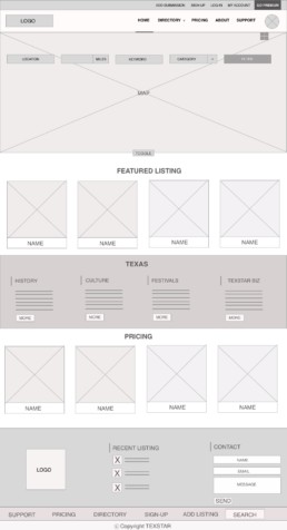
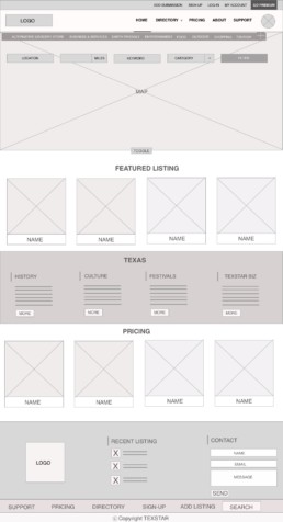
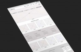
Everyone’s feedback were extremely useful. Overall they all said everything was pretty straightforward and easy to navigate. I had to make one change based on one of the participants suggestion. He is a business owner and he felt it would save him time if the Add Submission symbol dropped down with different categories. He said he felt it would act as a quick submission and can help him to skip through the category section of the submission page. Based on his suggestion I changed that part of the design. Here you can see the design before I made the change and if you slide it to the left, you can see the changes I made to the web page.
You can check out the prototype here TexStar Biz’s Prototype
Usability Testing
After wireframing, I created prototype and conducted usability testing to test and validate the usability of the following four tasks
1.) Sign-up
2.) Log-in
3.) Submit a Listing
4.) Search / Filter
The goal was to create an intuitive site where the users can go straight to the section they are looking for – whether it is searching for a place, product , event or listing a business.
I conducted the testing individually because everyone had a different schedule and it was difficult to synchronize their schedule. Since the participants have different work schedule and based on their suggestion, I conducted the usability testing remotely. I used 4 participants for this usability testing. All of them were Millennials and Generation X – they were within 20yrs to 45yrs age group. The participants all came from different background – Visual Designer, Business Owner, Engineer and Student. They reside mostly in urban and suburban parts of state.
For the most part, the participants sailed through the site and accomplished the tasks without any issue. It was interesting to note that one of the tasks I thought might confuse the participants ended up being a design that was easy to locate, example the plus symbol right below the main navigation menu. I already had few “ Add Submission” links, so I was afraid they would not be able to identify it as “Submit a Listing”. Initially I thought it was a bit too much and even intended on removing it from the web pages. But later I decided to wait till I completed the usability testing before making any changes
TexStar Biz UX Process


